BRAND STYLE GUIDE
BRAND STYLE GUIDE

The Concept
We wanted to ensure that people could quickly identify the project’s tie to Indiana. We landed on marrying the Indiana state flag with a fork. Swapping out the torch with a fork was a clever way to accomplish our goal while offering an “ah-ha!” moment.
Industry
Food + Beverage
Services
Brand Identity
Brand Marks
We wanted to ensure that people could quickly identify the project’s tie to Indiana. We landed on marrying the Indiana state flag with a fork. Swapping out the torch with a fork was a clever way to accomplish our goal while offering an “ah-ha!” moment.
Looking for logo usage rules? Click Here
Looking for logo usage rules? Click Here
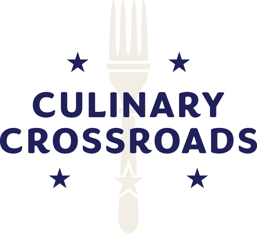
primary logo
This is the preferred logo
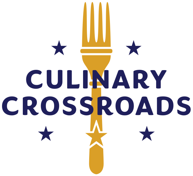
Secondary Logos
Use these secondary logo when using the primary logo is not recommended.

Download These Brand Assets
Click download to receive the full asset library.
Use this webpage & the guide as a reference for proper usage.
Typography
We really like the idea of using a bold, approachable and inclusive font that would appeal to men and women of all ages. As the project grows we don’t want the font to alienate a group from participation.
Congenial Heavy
abcdefghijklmnopqrstuvwxyz
ABCDEFGHIJKLMNOPQRSTUVWXYZ
1234567890!@#$%^&*()
Color Palette
These are the correct primary brand colors, please follow them to maintain brand recognition and consistency. The color palette was chosen using colors from the Indiana State flag.

NAVY
| HEX | 20205B |
| PANTONE | 274 C |
| CMYK | 100, 99, 33, 26 |
| RGB | 32, 32, 91 |

CREAM
| HEX | F2EDE5 |
| PANTONE | 468 C (30%) |
| CMYK | 4, 5, 8, 0 |
| RGB | 242, 237, 229 |

GOLDENROD
| HEX | DA9F27 |
| PANTONE | 7563 C |
| CMYK | 15, 38, 100, 0 |
| RGB | 218, 159, 39 |
Logo Usage:
Do’s and Don’ts
Please follow these guidelines when using these brand assets to maintain brand recognition and consistency.
Minimum Clear Space
To protect the integrity of the brand, always maintain a minimum clear space around the logos. This clear space isolates the logo from other graphic elements such as other logos, copy, photography or background patterns that may divert attention.
The minimum clear space for the primary logo should be at least twice the cap height of the CULINARY CROSSROADS text.
The minimum clear space for the secondary logo should be at least twice the cap height of TEAM INDIANA text.
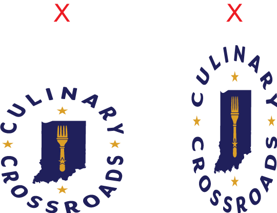
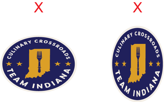
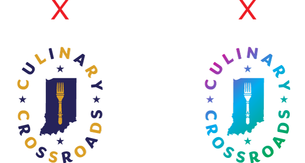
do not alter logo dimensions
The dimensions of the artwork have been selected accordingly and should never be altered. These examples show improper usage.
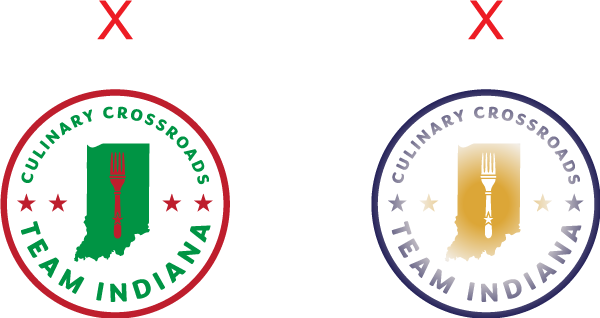
do not alter logo colors
The logo colors have been carefully chosen and should never be altered. These examples show improper usage.

minimum size
For maximum performance, it is recommended
that the minimum size guidelines be followed when reproducing of the artwork.
be 17mm across, whilst retaining the priginal set dimentions. This roughly equates to 80 pixels on screen.
Logo Usage:
Color Combinations
Please follow these guidelines when using these brand assets to maintain brand recognition and consistency.
single color | primary logo
Can be used over an image as a watermark or when only one color can be used in print. If you must display the logo on a colored background that is outside of the brand colors, please use one of the single color logo options, OR black or white.
2 COLOR | PRIMARY LOGO
The options displayed here are the approved color combinations when using the primary logo in print or digital.
3 COLOR | TEAM INDIANA SEAL
The options displayed here are the approved color combinations when using the badge in print or digital.
2 color | Alternate lockup
The options displayed here are the approved color combinations when using the alternate lockup in print or digital.
FAQs
Please follow these guidelines when using these brand assets to maintain brand recognition and consistency.
Can I remake the logos with other colors or color combinations?
We would rather you didn’t. Here’s why:
Effective identity systems have both fixed and flexible pieces to ensure consistency while allowing for personalization. The more consistency we have, the more regcognizable and iconic our identity will become. This is especially important in the early days as we start to use the new logos.
Imagery and iconography are the flexible parts that can be determined by the user.
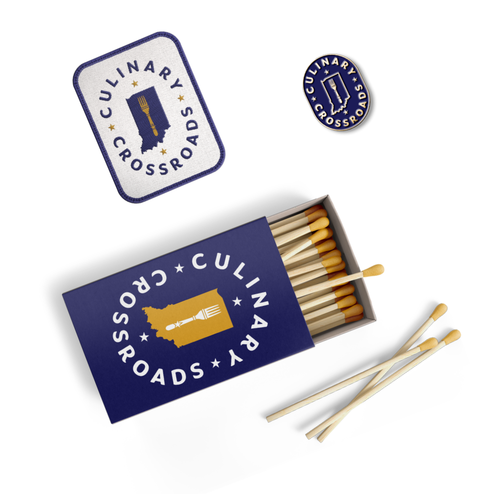
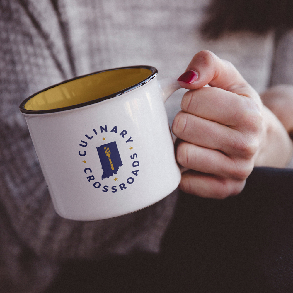
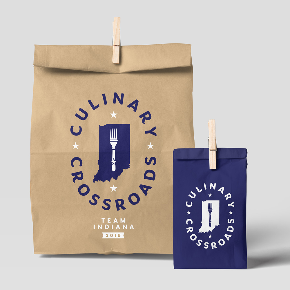
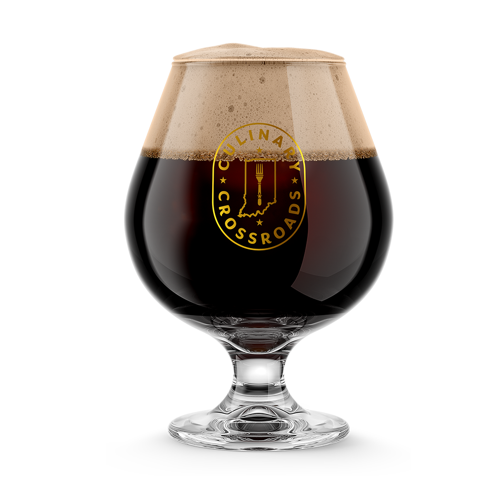
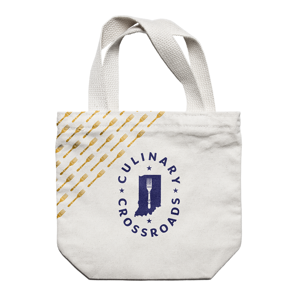
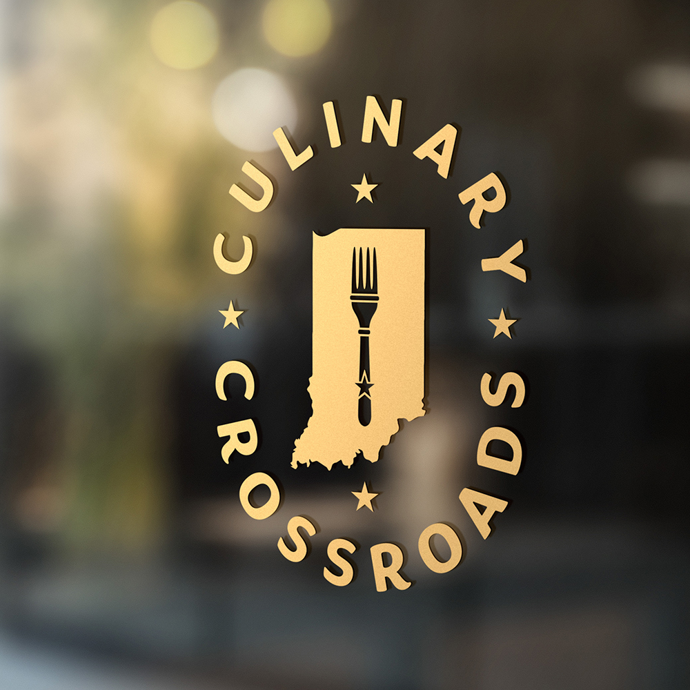
Applications
Sometimes it helps to visualize the brand in the wild. Here are a selection of mockups that we put together to help you get a sense of the brand at work.
Thank You!
Thank you for the opportunity. If you have any questions, comments, or concerns, we are all ears. Please direct feedback to nate@12linestudio.com, your creative director for this branding project.