The Concept
The Amani Coffee branding is fun and approachable, warm and friendly, earthy and clean. Amani Coffee has a close connection to the Democratic Republic of Congo, and wanted to incorporate the region and the spirit of the Congolese people to the Amani brand. We were able to successfully make this connection through the use of color, messaging, patterns, and illustrations.
Industry
Food + Beverage
Services
Brand Identity
Brand Marks
These are the approved brand marks for Amani Coffee. Please be sure to follow all brand guidelines when using these marks.
Looking for logo usage rules? Click Here
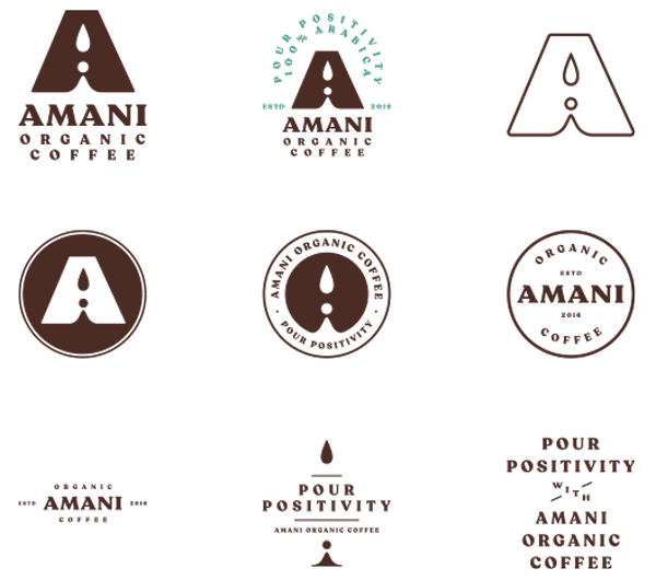
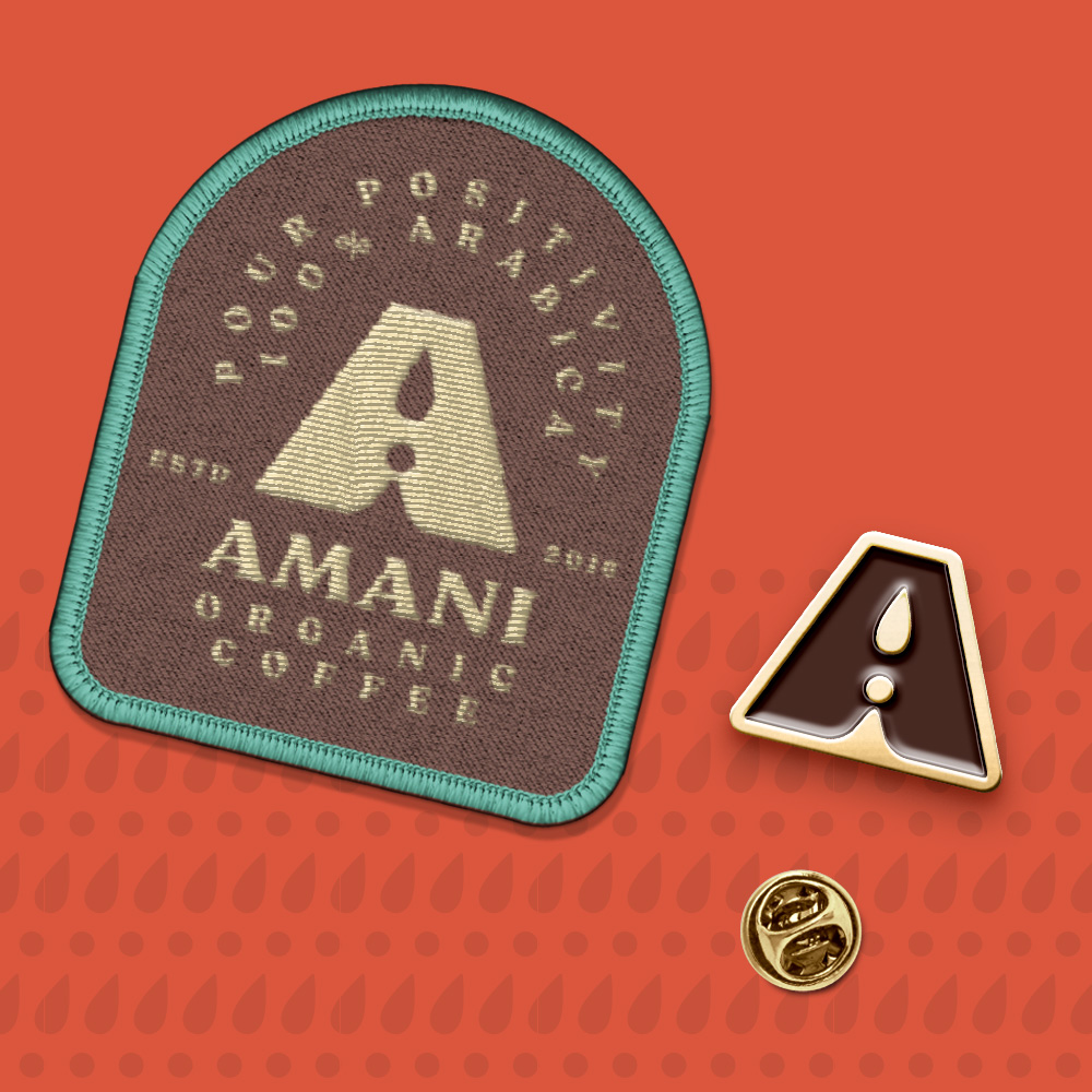
primary logo
This is the primary Amani Coffee logo, it should be used in most instances to help maintain consistency and brand recognition. It was designed to be simple and recognizable, while also being easily reproduced for print and digital. The “A” mark features a “coffee drip” to make up the interior of the “A” shape.
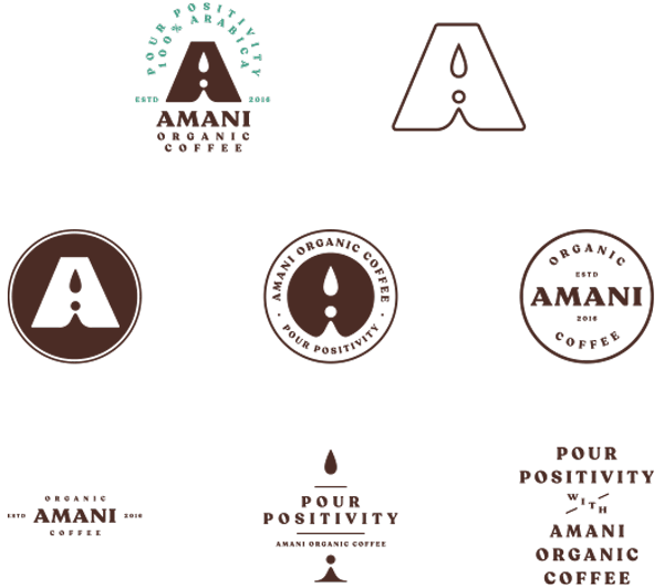
Secondary Logos
The secondary logos may be used as supplemental marks when the primary logo is already in use elsewhere on the piece, or in contextual situations where the Amani brand is already apparent.

Download These Brand Assets
Click download to receive the full asset library.
Use this webpage & the guide as a reference for proper usage.
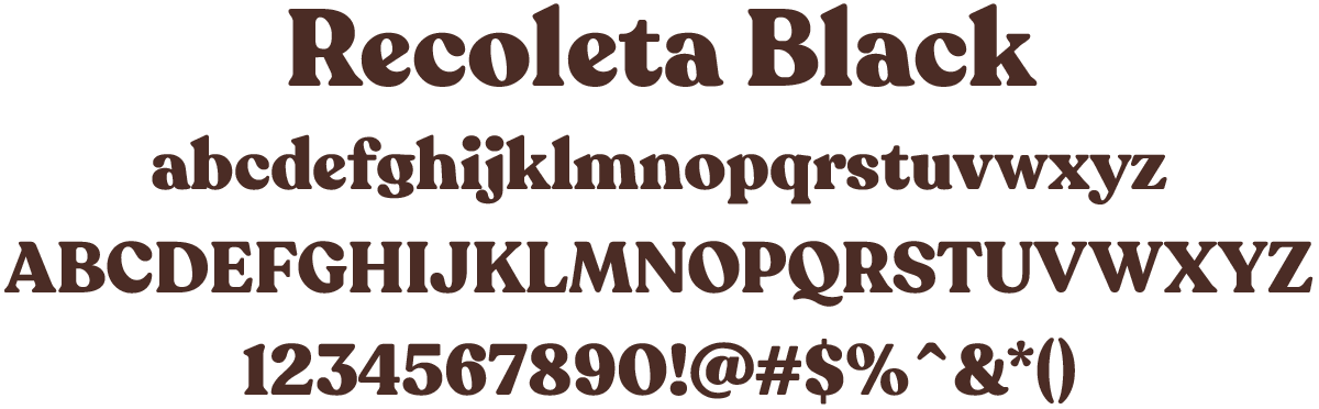
Typography
We chose Recoleta Black as the brand’s font family for it’s simplicity and legibility. It is both professional and playful, just like the brand.
Color Palette
These are the approved primary brand colors, please follow them to maintain brand recognition and consistency.
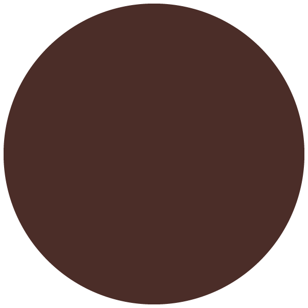
BROWN
| HEX | 4B2D28 |
| PANTONE | 4625 C |
| CMYK | 44, 69, 69, 42 |
| RGB | 75, 45, 38 |

BURNT ORANGE
| HEX | DB573E |
| PANTONE | 7625 C |
| CMYK | 9, 80, 82, 1 |
| RGB | 219, 87, 62 |

MINT
| HEX | 499E87 |
| PANTONE | 7723 C |
| CMYK | 72, 18, 55, 1 |
| RGB | 73, 158, 135 |

BEIGE
| HEX | E4D09B |
| PANTONE | 7500 C |
| CMYK | 11, 15, 44, 0 |
| RGB | 228, 208, 155 |
Logo Usage:
Do’s and Don’ts
Please follow these guidelines when using these brand assets to maintain brand recognition and consistency.
Minimum Clear Space
To protect the integrity of the brand, always maintain a minimum clear space around the logos. This clear space isolates the logo from other graphic elements such as other logos, copy, photography or background patterns that may divert attention.
The minimum clear space for the primary logo should be equal to the cap height of the text AMANI. This unit should also be used for all secondary marks as well when the secondary logo width matches the primary logo width.
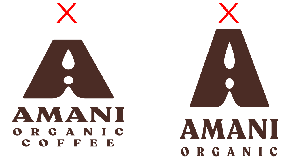
do not alter logo dimensions
The dimensions of the artwork have been carefully developed and should never be altered. Do not squash, stretch, skew, rotate or otherwise manipulate the proportions or orientation of any logo. These examples show improper usage.
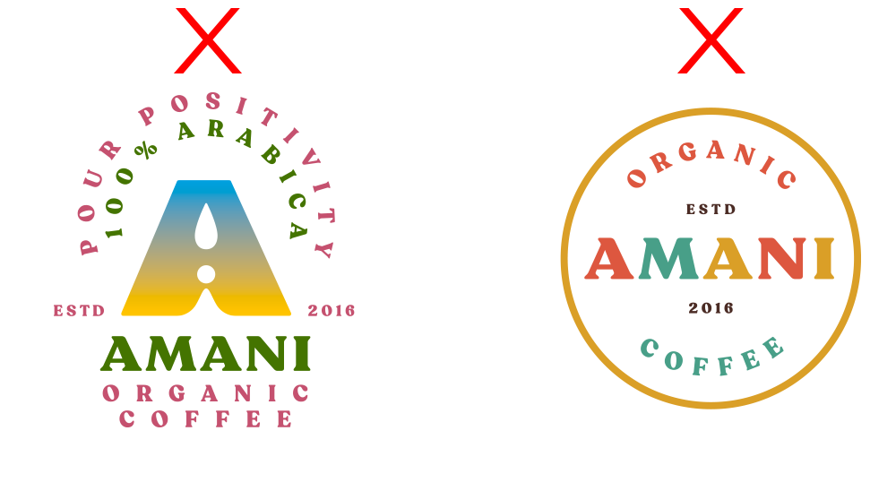
do not alter logo colors
The logo colors have been carefully chosen and should never be altered. Do not use gradients, transparency or tints when rendering any Amani Coffee logo.

minimum size
For maximum impact and readibiltiy, please be sure all text is clear and legible whenever using any of the Amani logos. In situations where the text will be too small to render clearly, please use either of the simple “A” marks.
Logo Usage:
Color Combinations
Please follow these guidelines when using these brand assets to maintain brand recognition and consistency.
Full logo | two color
Amani’s full logo may be displayed as a one color logo, or as a two color logo as shown here. When using this as a two color mark, please follow the color usage guidelines, as this mark should only be displayed in one of the approved color combinations shown here. If you must display the logo on a colored background that is outside of the brand colors, please use one of the single color logo options shown on the brown or beige background, or black or white.
All logos | One color
Amani’s logo, including all secondary marks may be displayed as one color, but should only be displayed in one of these color combinations or as black or white to maintain contrast between colors. If you must display the logo on a colored background that is outside of the brand colors, please use one of the single color logo options shown on the brown or beige background, or black or white.
FAQs
Please follow these guidelines when using these brand assets to maintain brand recognition and consistency.
Can I remake the logos with other colors or color combinations?
We would rather you didn’t. Here’s why:
Effective identity systems have both fixed and flexible pieces to ensure consistency while allowing for personalization. The more consistency we have, the more regcognizable and iconic our identity will become. This is especially important in the early days as we start to use the new logos.
Imagery and iconography are the flexible parts that can be determined by the user.
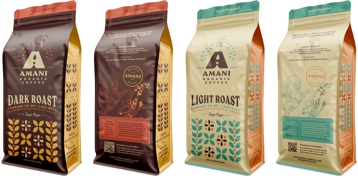
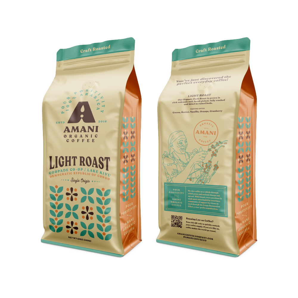
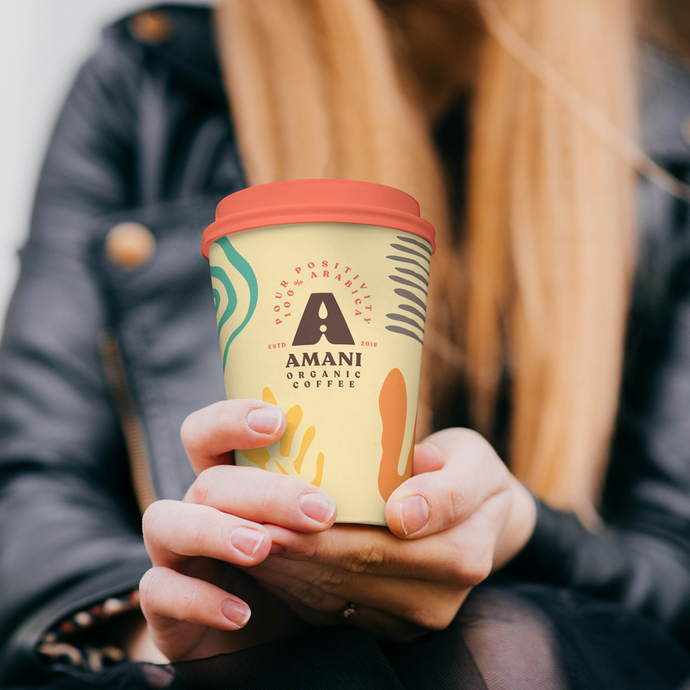
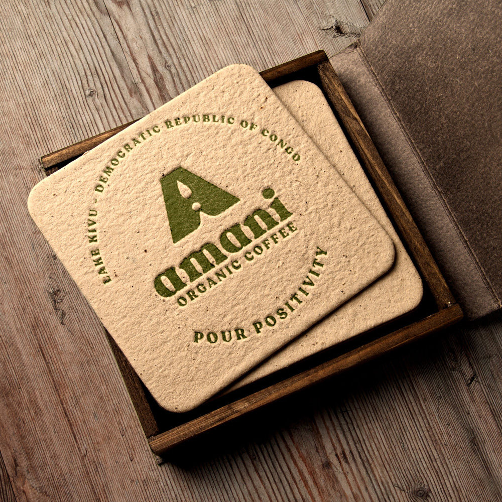
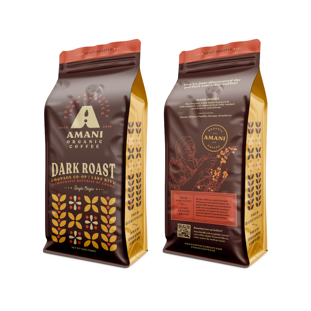
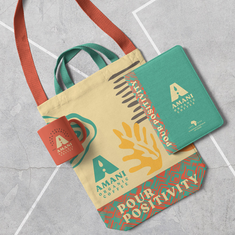
Applications
Sometimes it helps to visualize the brand in the wild. Here are a selection of mockups that we put together to help you get a sense of the brand at work.
Applications
Sometimes it helps to visualize the brand in the wild. Here are a selection of mockups that we put together to help you get a sense of the brand at work.
Thank You!
Thank you for the opportunity. If you have any questions, comments, or concerns, we are all ears. Please direct feedback to nate@12linestudio.com, your creative director for this branding project.