The Concept
The Center for Creative Entrepreneurship branding is clean and inviting, both approachable and organized, fun and focused. This careful balance breathes energy and excitement into the Center for Creative Entrepreneurship brand.
Industry
Education
Services
Brand Identity
Brand Marks
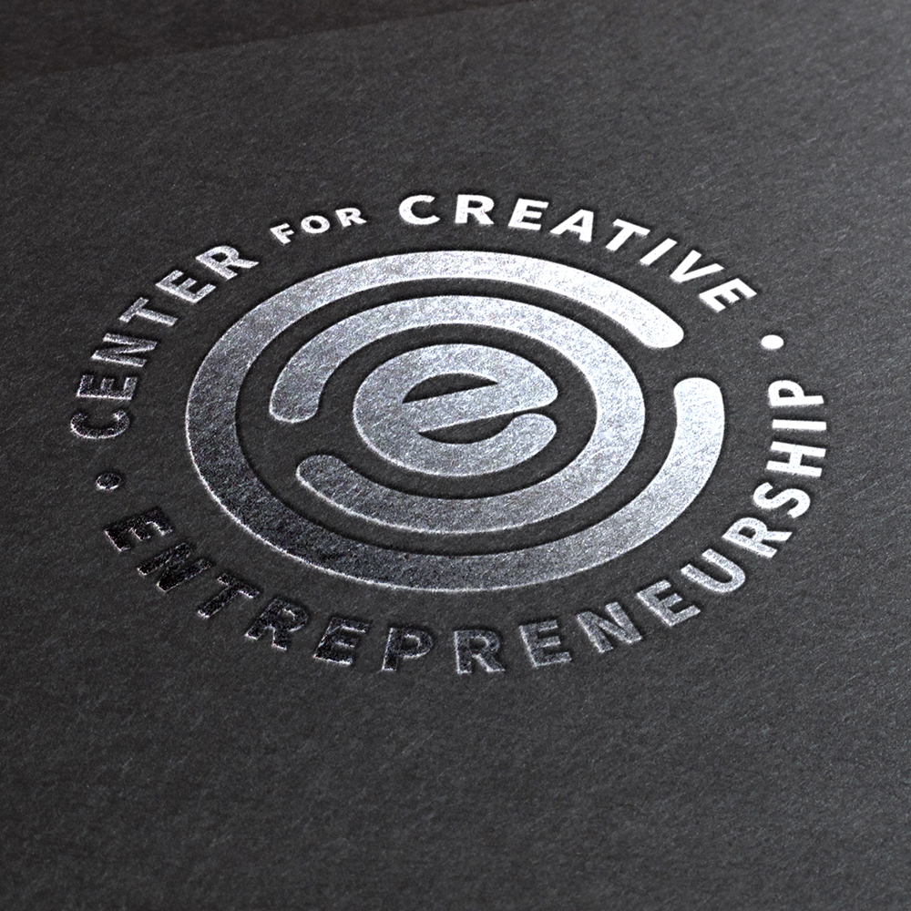
These are the approved brand marks for Center for Creative Entrepreneurship. Please be sure to follow all brand guidelines when using these marks.
Looking for logo usage rules? Click Here

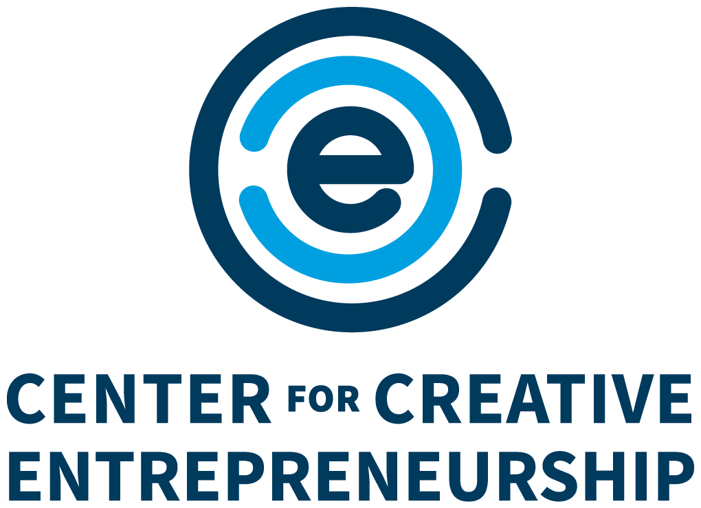
primary logo
These are the primary logos. It is preferred to use the stacked logo whenever possible, although the inline version may also be used when appropriate.
Secondary Logos
Use these secondary logo when using the primary logo is not recommended.

Download These Brand Assets
Click download to receive the full asset library.
Use this webpage & the guide as a reference for proper usage.
Typography
We chose Source Sans Variable as the brand’s font family for it’s simplicity and legibility. It is both professional and playful, just like the brand.
Source Sans Variable Bold
abcdefghijklmnopqrstuvwxyz
ABCDEFGHIJKLMNOPQRSTUVWXYZ
1234567890!@#$%^&*()
Source Sans Variable Regular
abcdefghijklmnopqrstuvwxyz
ABCDEFGHIJKLMNOPQRSTUVWXYZ
1234567890!@#$%^&*()
Color Palette
These are the approved primary brand colors, please follow them to maintain brand recognition and consistency.

NAVY
| HEX | 003A5D |
| PANTONE | 302 C |
| CMYK | 100, 78, 39, 29 |
| RGB | 0, 58, 93 |

CYAN
| HEX | 00A0DE |
| PANTONE | 299 C |
| CMYK | 75, 21, 0, 0 |
| RGB | 0, 160, 223 |

YELLOW
| HEX | FFC600 |
| PANTONE | 7548 C |
| CMYK | 0, 22, 100, 0 |
| RGB | 35, 31, 32 |
Logo Usage:
Do’s and Don’ts
Please follow these guidelines when using these brand assets to maintain brand recognition and consistency.
Minimum Clear Space
To protect the integrity of the brand, always maintain a minimum clear space around the logos. This clear space isolates the logo from other graphic elements such as other logos, copy, photography or background patterns that may divert attention.
The minimum clear space for all logos should be at least twice the cap height of the text CENTER CREATIVE ENTREPRENEURSHIP.
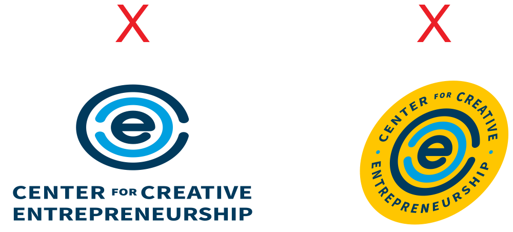
do not alter logo dimensions
The dimensions of the artwork have been carefully developed and should never be altered. Do not squash, stretch, skew, rotate or otherwise manipulate the proportions or orientation of any logo. These examples show improper usage.
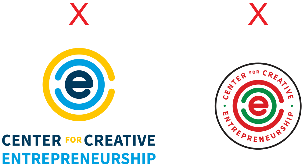
do not alter logo colors
The logo colors have been carefully chosen and should never be altered. Do not use gradients, transparency or tints when rendering any CCE logo.


minimum size
For maximum impact and readability, please follow the minimum height guidelines below when reproducing the artwork.
Primary Stacked
For Print: 0.625″ h
For Web: 80 px h
Primary Inline
For Print: 0.3125″ h
For Web: 40 px h
Secondary
For Print: 0.75″ h
For Web: 100 px h
Logo Usage:
Color Combinations
Please follow these guidelines when using these brand assets to maintain brand recognition and consistency.
primary logos: STACKED & Inline | Two color
The primary logos were designed to be used on white or light neutral colored background to maintain contrast between the logo and the background. Please use the secondary logo whenever the background will not be white or a light neutral color.
SECONDARY LOGO: BADGE | THREE COLOR
The secondary logo is designed with equal height and width for scenarios where the primary logo can not be used. The secondary logo should also be used whenever the background will not be white or a light neutral color.
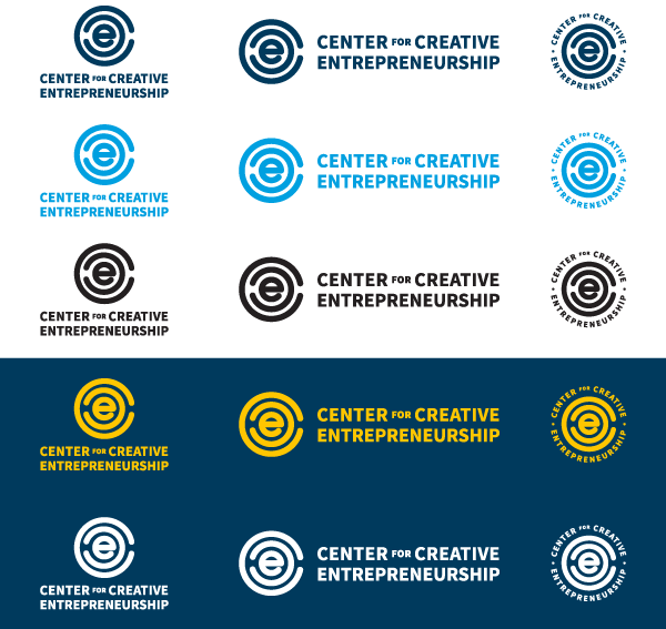
All logos | one color
Please use the full color logos above whenever possible, however instances may arise where using the full color logos is not an option. In those instances, all logos may be used as one color as shown here. Before using the secondary badge logo, please remove the outer circle first. Use white logos when used on dark background colors, or use any of the other colors shown when used on white or light neutral colored backgrounds.
FAQs
Please follow these guidelines when using these brand assets to maintain brand recognition and consistency.
Can I remake the logos with other colors or color combinations?
We would rather you didn’t. Here’s why:
Effective identity systems have both fixed and flexible pieces to ensure consistency while allowing for personalization. The more consistency we have, the more regcognizable and iconic our identity will become. This is especially important in the early days as we start to use the new logos.
Imagery and iconography are the flexible parts that can be determined by the user.
Applications
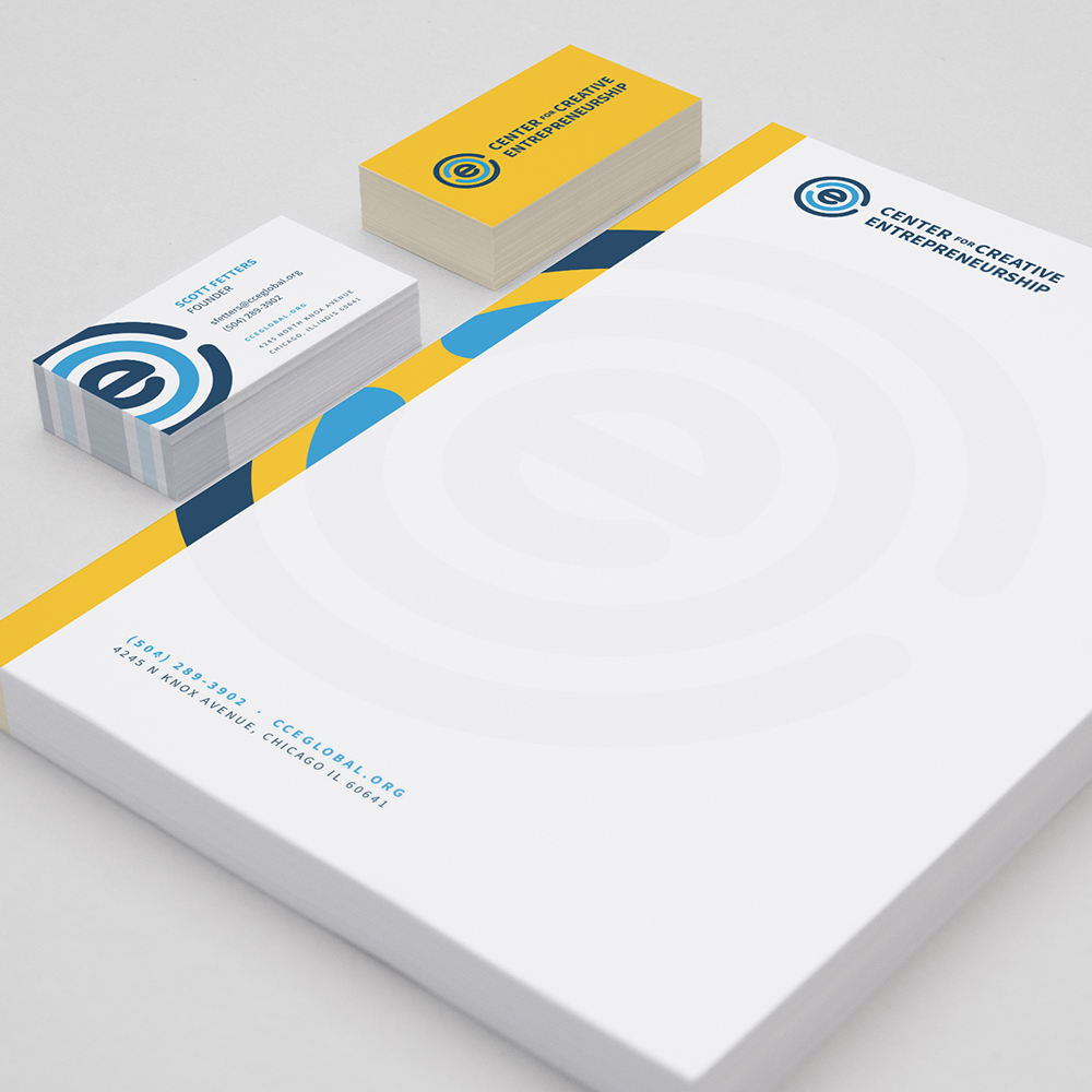
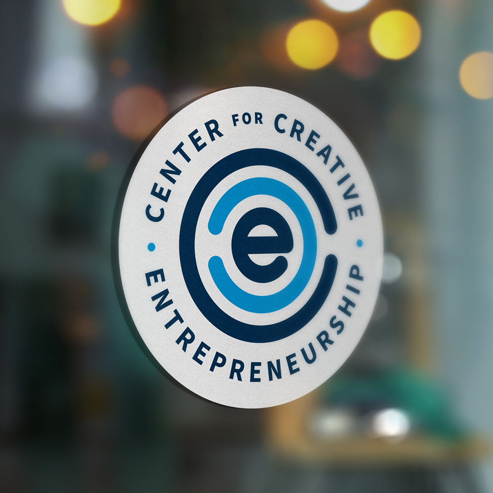
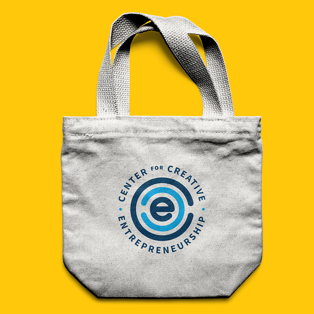
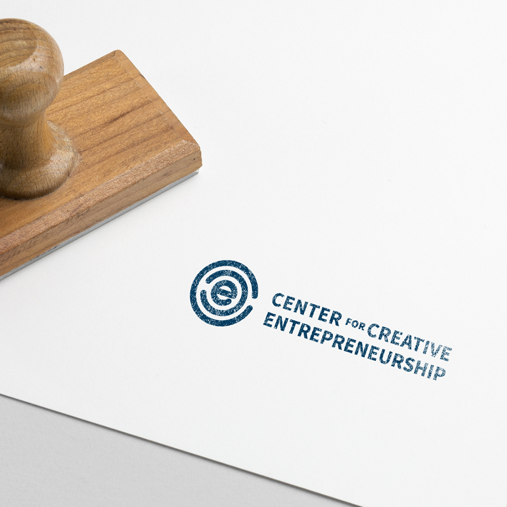
Sometimes it helps to visualize the brand in the wild. Here are a selection of mockups that we put together to help you get a sense of the brand at work.
Applications
Sometimes it helps to visualize the brand in the wild. Here are a selection of mockups that we put together to help you get a sense of the brand at work.

Thank You!
Thank you for the opportunity. If you have any questions, comments, or concerns, we are all ears. Please direct feedback to nate@12linestudio.com, your creative director for this branding project.