BRAND STYLE GUIDE
BRAND STYLE GUIDE
The Concept
Jim Cornelison is a widely recognized figure in the professional sports community for his powerful, operatic national anthem performances. The nature of Jim’s work strongly connects him to sources of national pride such as our national anthem, our veterans and active service members, and every patriotic American. We wanted to incorporate familiar American iconography and colors with a slight twist to create something both unique, and recognizable. The colors and iconography immediately invoke feelings of patriotism while coming across as both personal and professional, approachable and resolute.
Industry
Education
Services
Brand Identity
Brand Marks
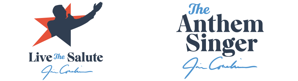
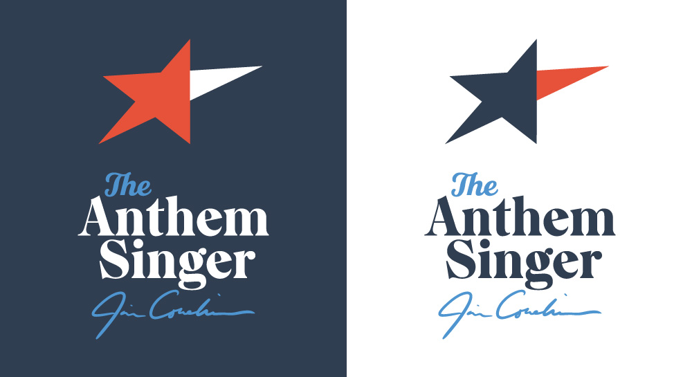
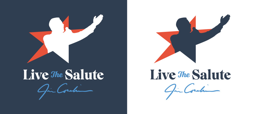
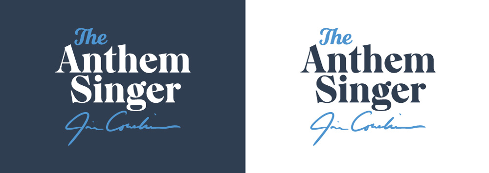
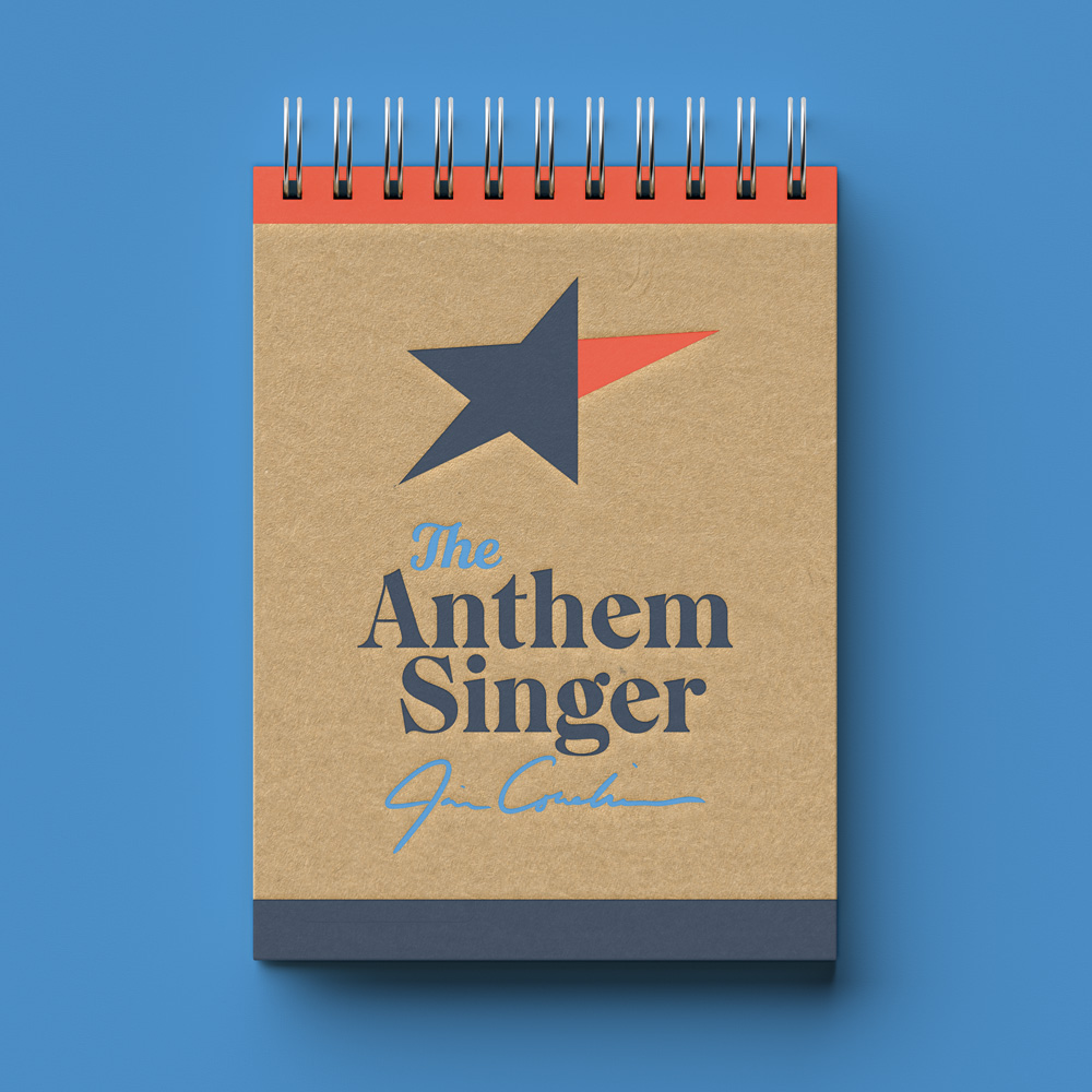
These are the approved brand marks for Jim Cornelison, The Anthem Singer and Live the Salute. Please be sure to follow all brand guidelines when using these marks.
Looking for logo usage rules? Click Here

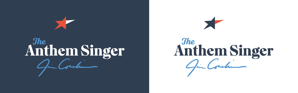
primary logo
These are the primary logos. It is preferred to use the full stacked logo whenever possible, although the short stacked and inline versions may also be used when appropriate.
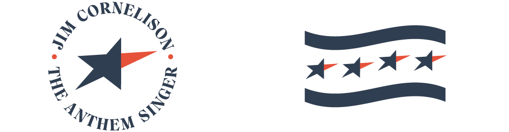

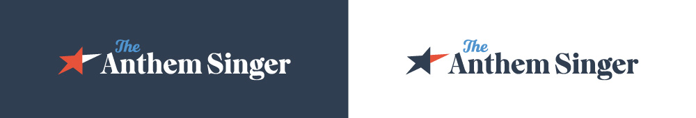
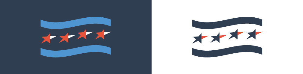
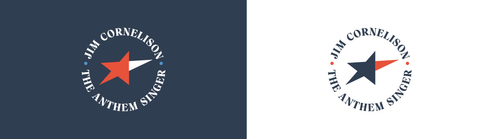
Secondary Logos
The secondary logos may be used as alternate or supplemental marks when the primary logo is already in use, or in situations where the Jim Cornelison brand is already apparent. The Live the Salute logo is specific to Jim’s charitable work and should only be used for Live the Salute initiatives and events.
Download These Brand Assets
Click download to receive the full asset library.
Use this webpage & the guide as a reference for proper usage.
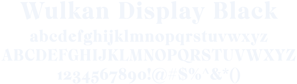
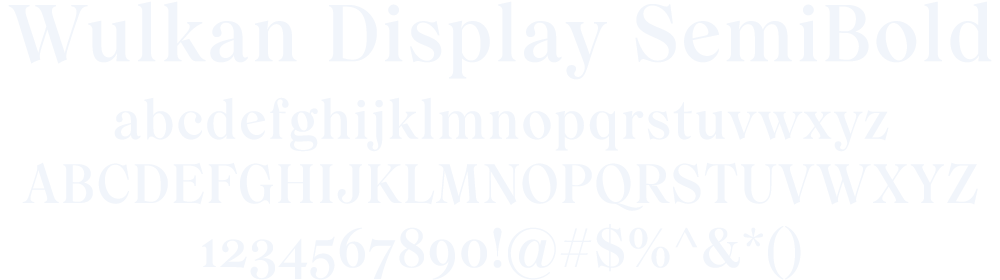
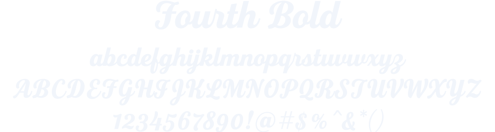
Typography
We really like the idea of using bold, approachable fonts that fit well with the concept. We chose Wulkan – a familiar looking classic serif font, but with a modern twist that balances nicely with Fourth – a bold script style font reminiscent of Independence Day celebrations.
Color Palette
These are the approved primary brand colors. We wanted to incorporate a familiar American color palette with a slight twist to create something both unique, and recognizable. Please follow these color guidelines to maintain brand recognition and consistency.

NAVY
| HEX | 303E51 |
| PANTONE | 432 C |
| CMYK | 83, 70, 47, 38 |
| RGB | 48, 62, 81 |

RED
| HEX | 00A0DE |
| PANTONE | 299 C |
| CMYK | 75, 21, 0, 0 |
| RGB | 0, 160, 223 |

LIGHT BLUE
| HEX | FFC600 |
| PANTONE | 7548 C |
| CMYK | 0, 22, 100, 0 |
| RGB | 35, 31, 32 |
Logo Usage:
Do’s and Don’ts
Please follow these guidelines when using these brand assets to maintain brand recognition and consistency.
Minimum Clear Space
To protect the integrity of the brand, always maintain a minimum clear space around the logos. This clear space isolates the logo from other graphic elements such as other logos, copy, photography or background patterns that may divert attention.
The minimum clear space for most logo will be equal to the cap height of the largest text in the logo.
Use twice the cap height for the circular seal logo.
Use the star height for the waving flag logo.
Use the @ height for the @anthem_singer logo.
Use 1/4 the start height for the star logo.
do not alter logo dimensions
The dimensions of the artwork have been carefully developed and should never be altered. Do not squash, stretch, skew, rotate or otherwise manipulate the proportions or orientation of any logo. These examples show improper usage.
do not alter logo colors
The logo colors have been carefully chosen and should never be altered. Do not use gradients, transparency or tints when rendering any brand logo.
minimum size
For maximum impact and readibiltiy, please be sure all text is clear and legible whenever rendering any of the brand logos. In situations where the text will be too small to render clearly, please use the leaning star logo.
Logo Usage:
Color Combinations
Please follow these guidelines when using these brand assets to maintain brand recognition and consistency.


primary logos: STACKED & Inline | Two color
The logos have all been designed as two or three color marks for use on navy, or light neutral color backgrounds (white, gray, natural).
One color versions of each logo are available for use when necessary, but it is always preferred to use the full color version of any logo. One color logos may be rendered in any of the approved brand colors, or in black or wihte. For logos and copy, always maintain contrast between colors for maximum readability. For example, avoid using Light Blue on Red and vice versa.
FAQs
Please follow these guidelines when using these brand assets to maintain brand recognition and consistency.
Can I remake the logos with other colors or color combinations?
We would rather you didn’t. Here’s why:
Effective identity systems have both fixed and flexible pieces to ensure consistency while allowing for personalization. The more consistency we have, the more regcognizable and iconic our identity will become. This is especially important in the early days as we start to use the new logos.
Imagery and iconography are the flexible parts that can be determined by the user.
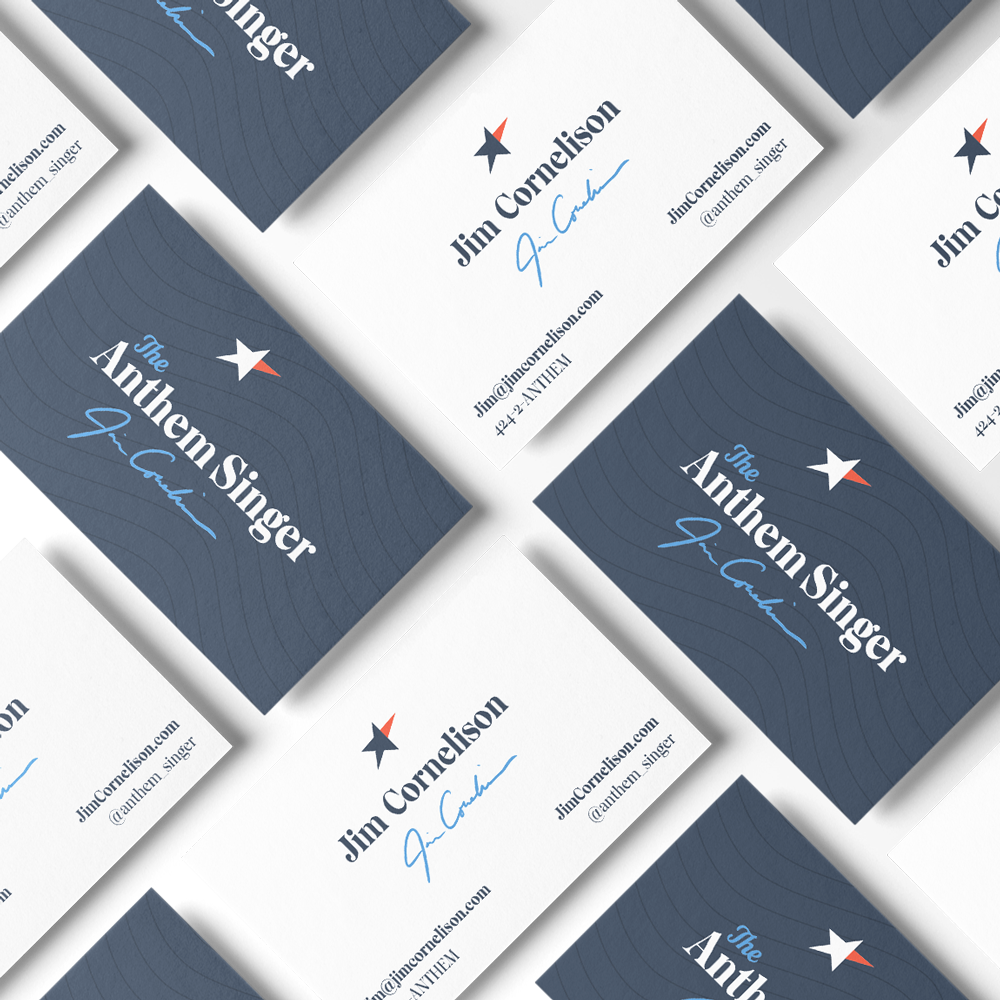
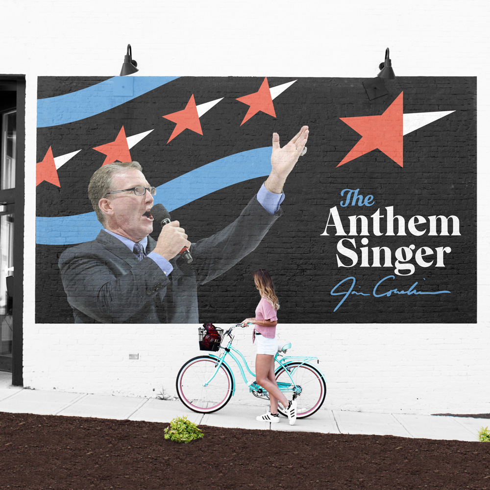
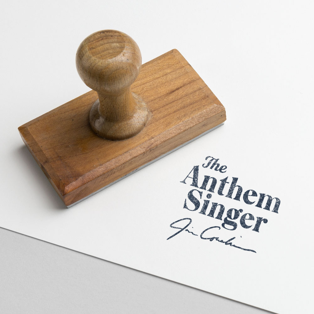
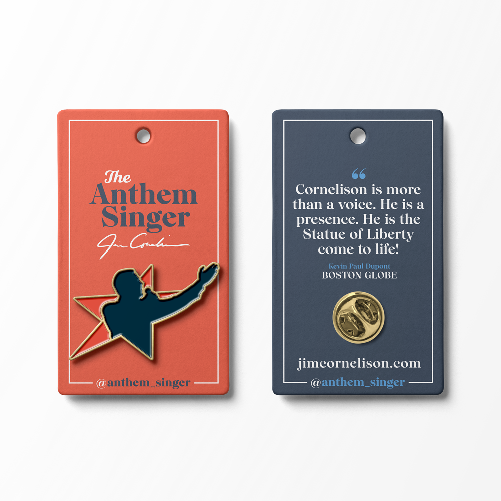
Applications
Sometimes it helps to visualize the brand in the wild. Here are a selection of mockups that we put together to help you get a sense of the brand at work.
Applications
Sometimes it helps to visualize the brand in the wild. Here are a selection of mockups that we put together to help you get a sense of the brand at work.
Thank You!
Thank you for the opportunity. If you have any questions, comments, or concerns, we are all ears. Please direct feedback to nate@12linestudio.com, your creative director for this branding project.