Brand Identity · Packaging
MINO
The brief
MINO wanted to be a trailblazer in cannabis. I started by getting to know the brand inside and out, then built its personality and voice from the ground up. The identity, packaging, and merch all grew from there.
The line
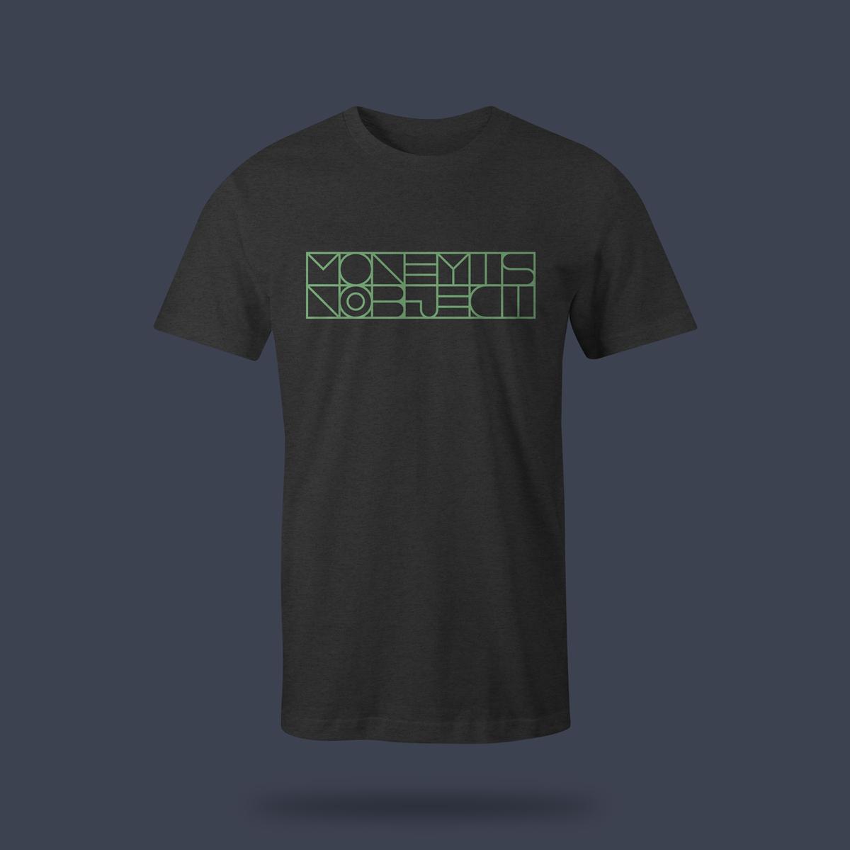
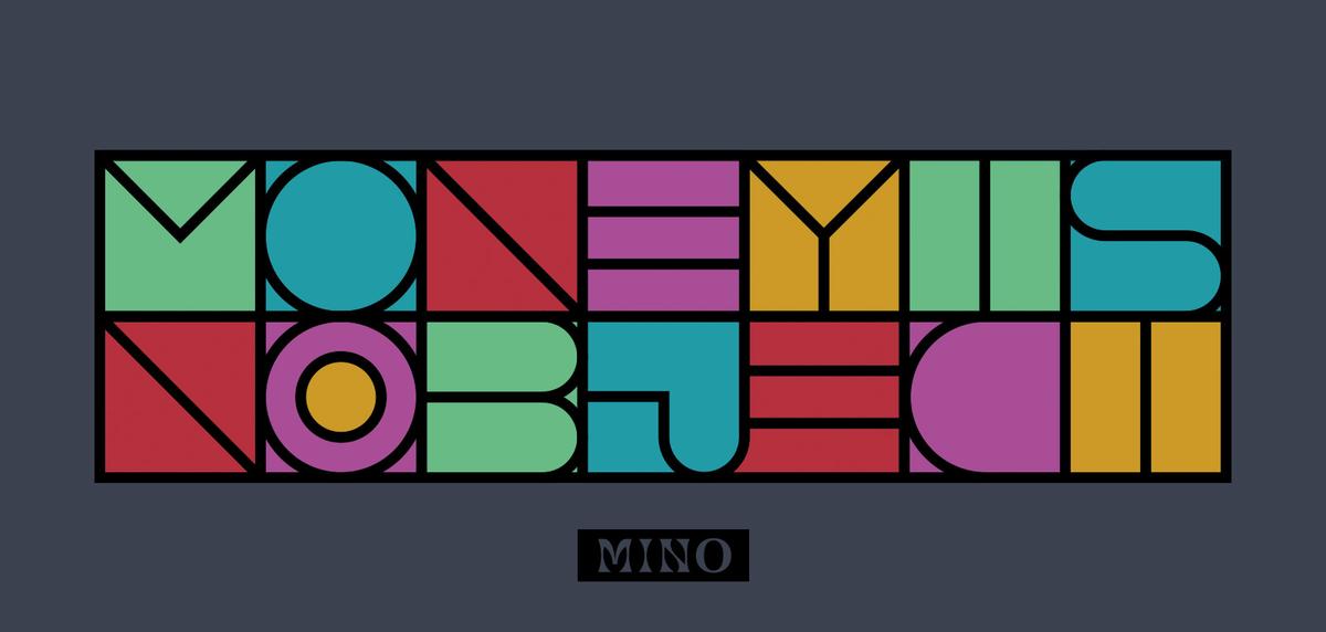
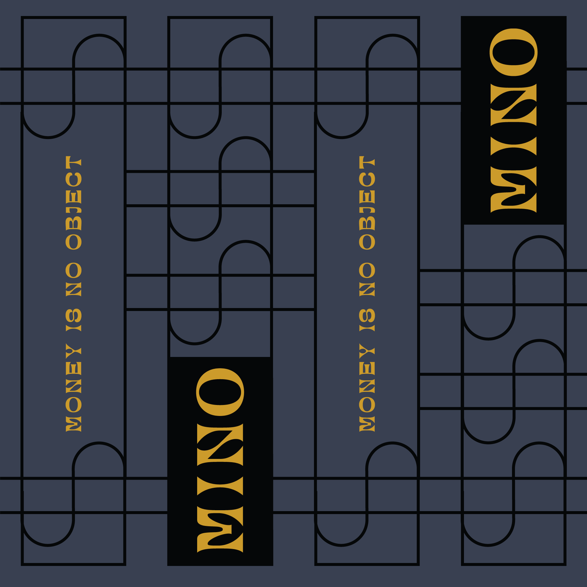
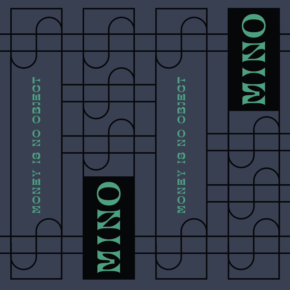
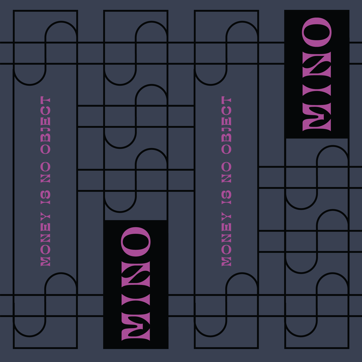
Money Is No Object.
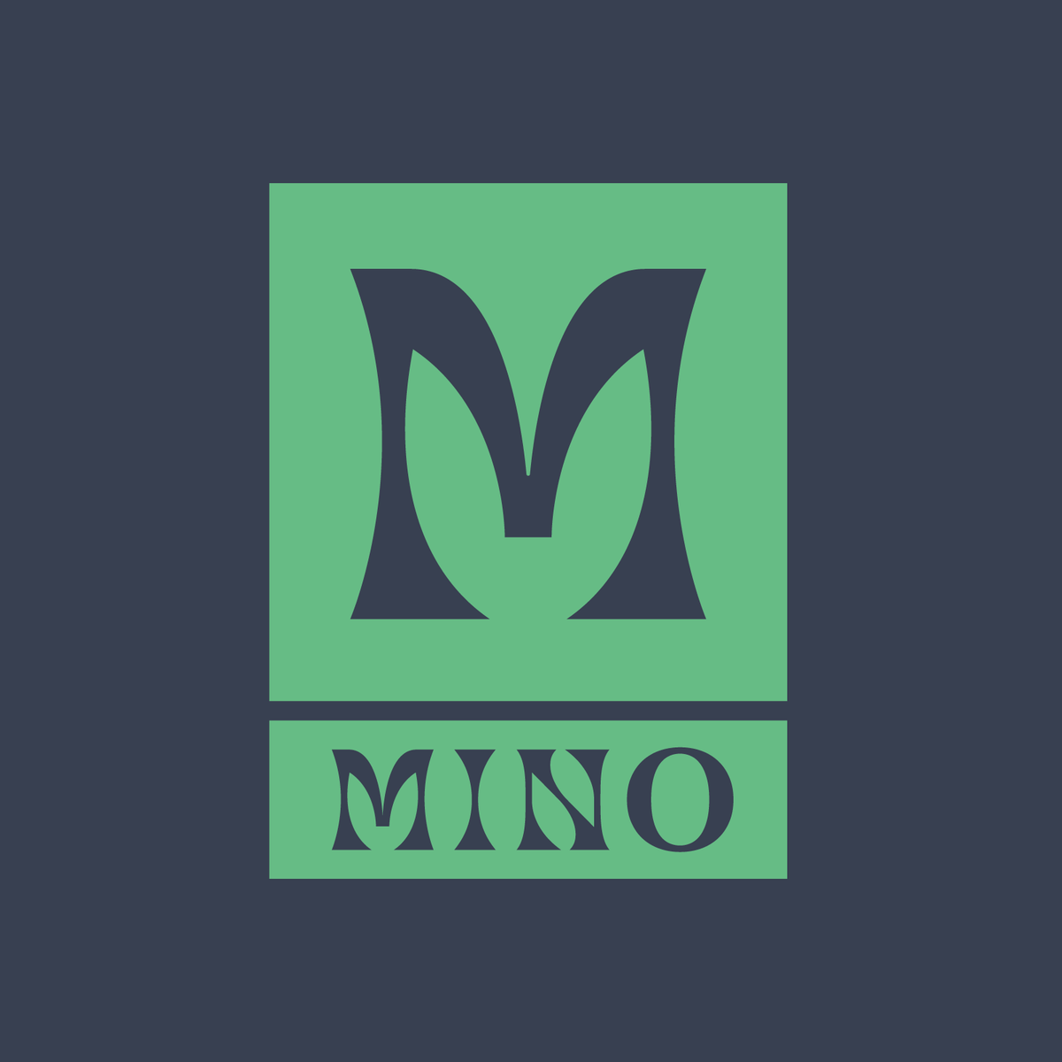
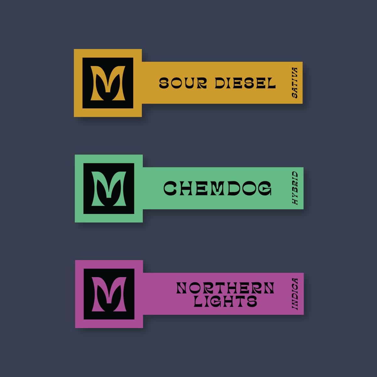
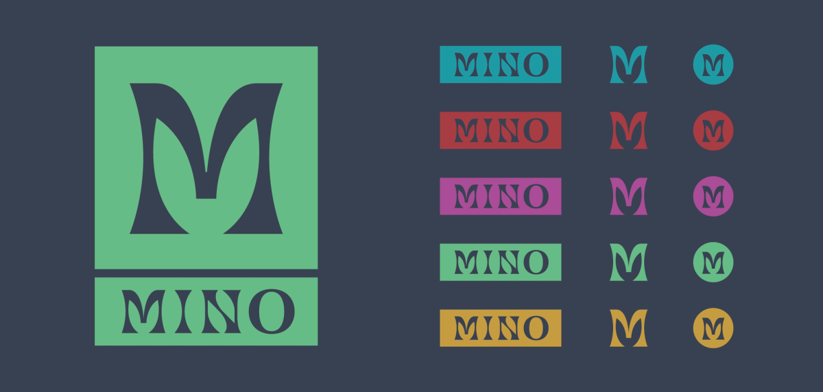
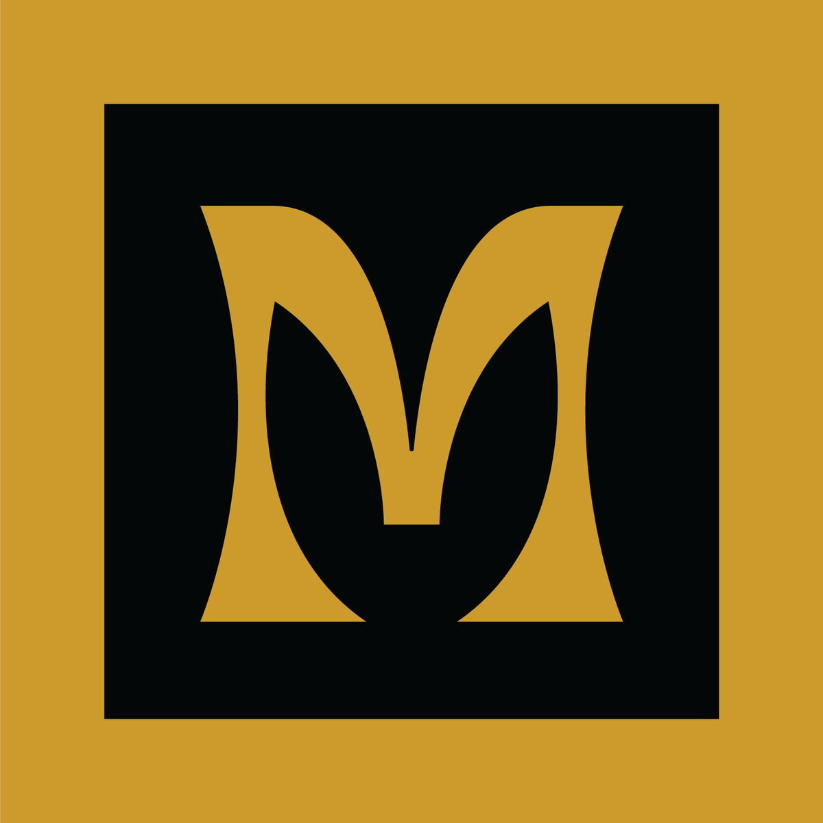
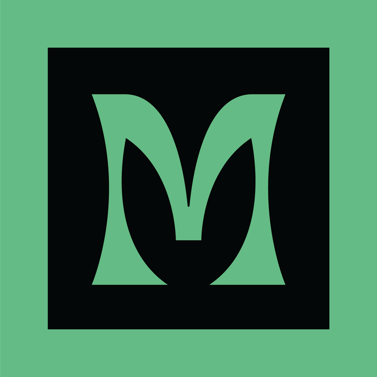
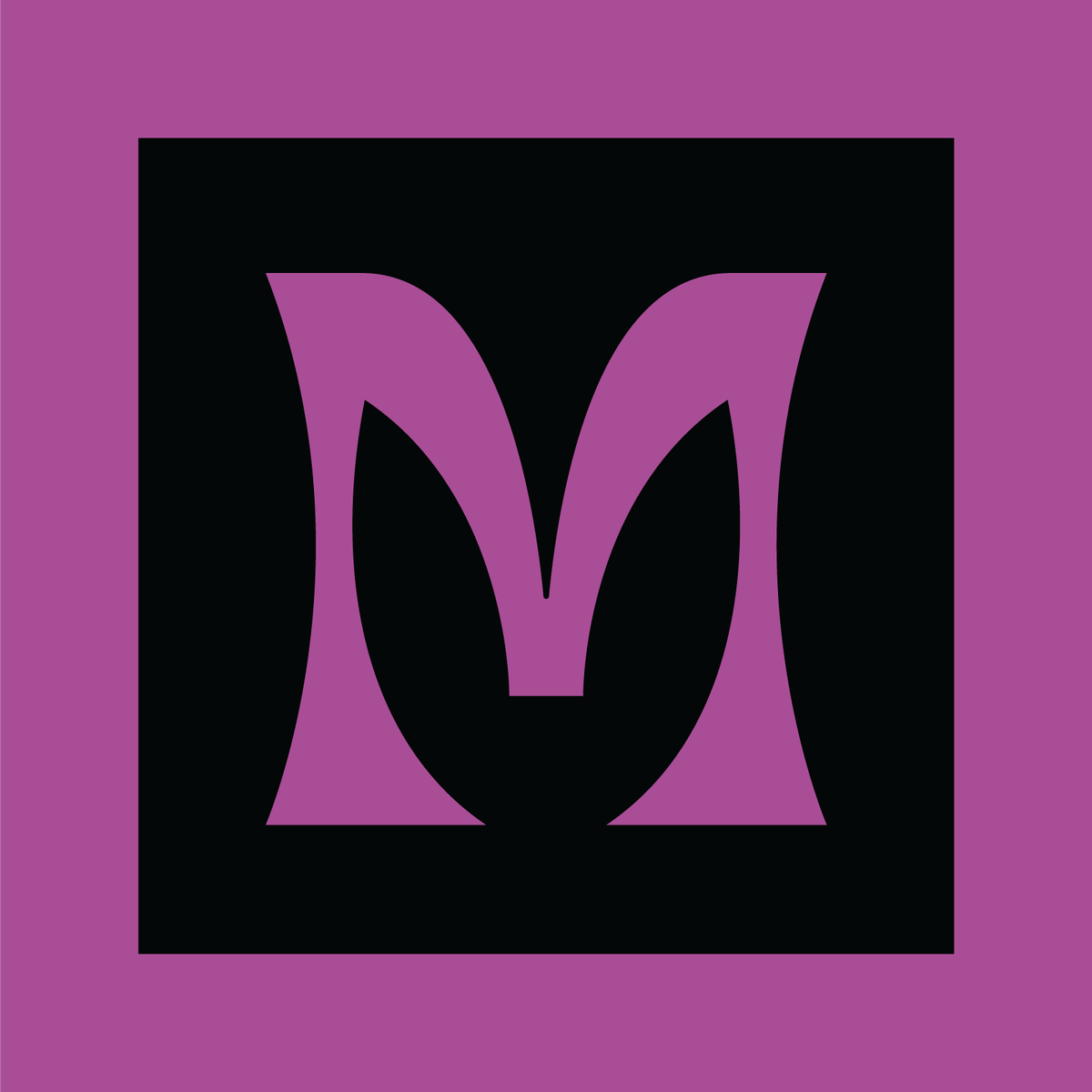
One mark, made to wear every color in the palette.
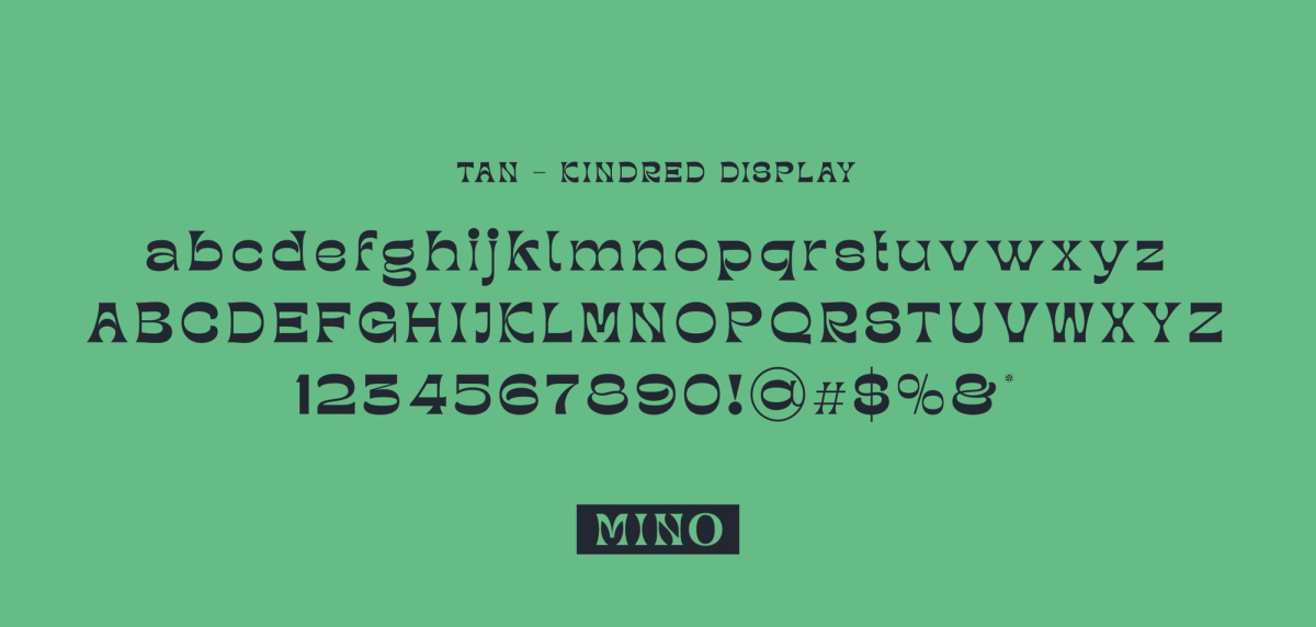
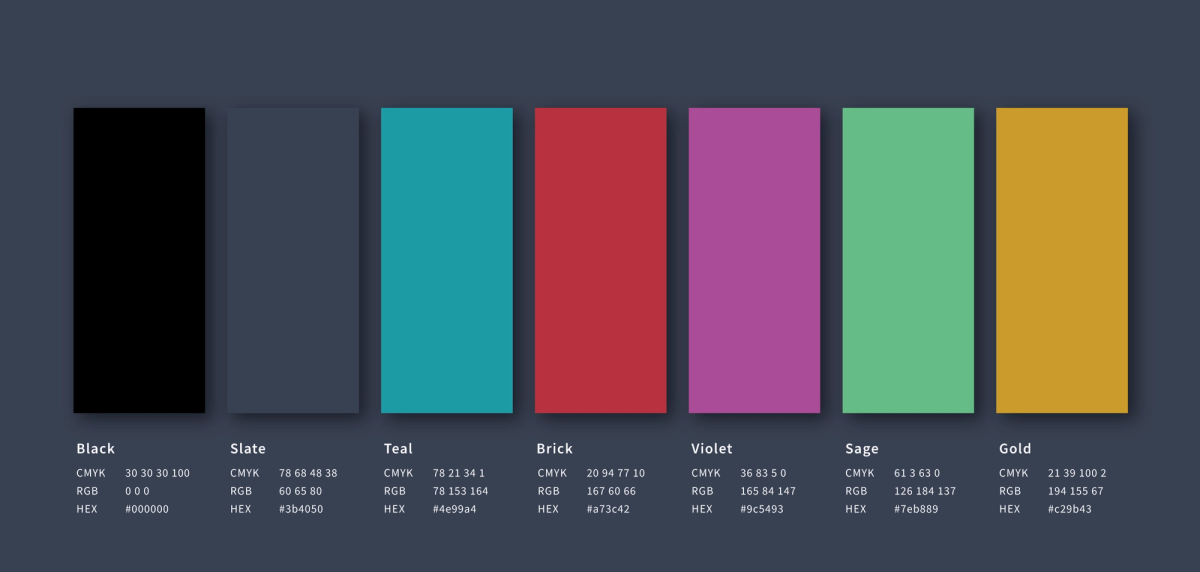
A logo and wordmark system, a seven-color palette from Black to Gold, and Tan Kindred Display for type.
When collaborating with 12 Line, they execute high caliber work, while keeping our bottom line in mind. One of the biggest benefits to working with Nate and the team is that they think beyond the deliverables and develop work that ties into our marketing and sales strategies. They truly understand every side of our business, and strategically make decisions that will have a positive impact.
Louie Boulahanis
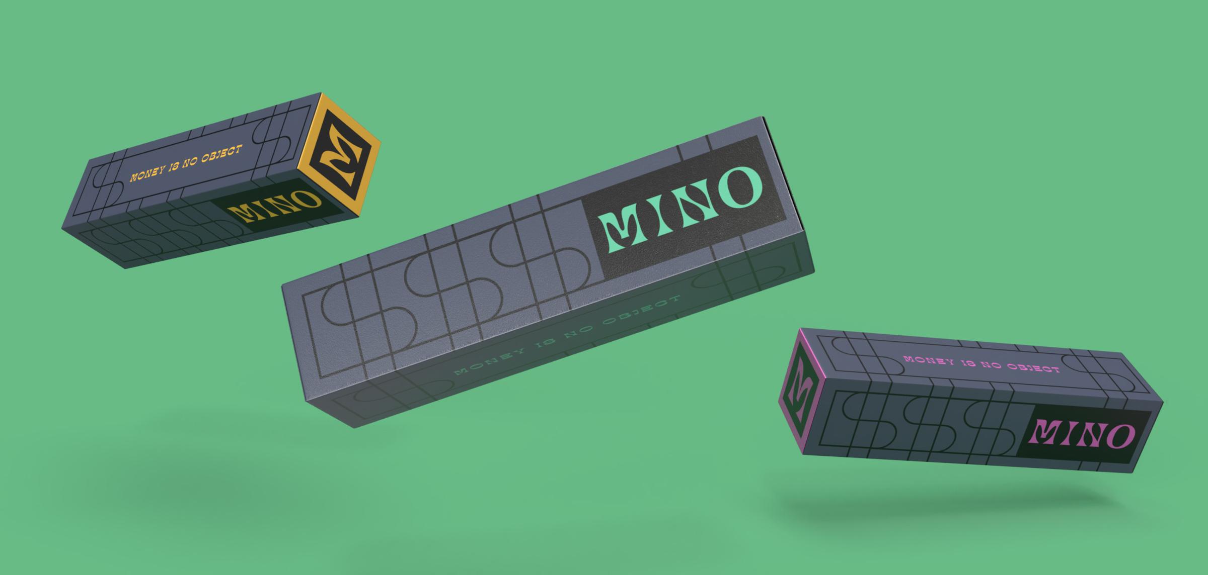
Packaging that lives up to the line.
I designed packaging for rosin, flower, and pre-rolls. The pre-roll boxes come in gold, teal, and violet, each capped with its own M.
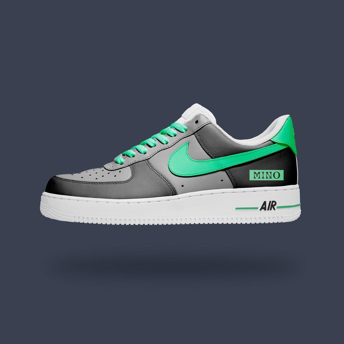
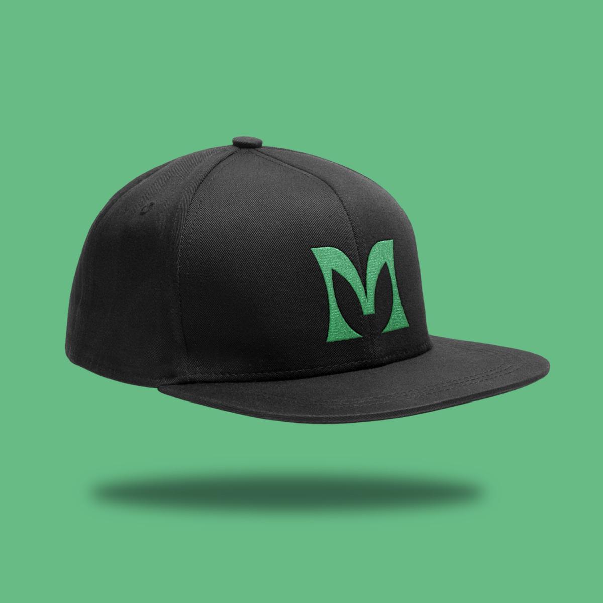
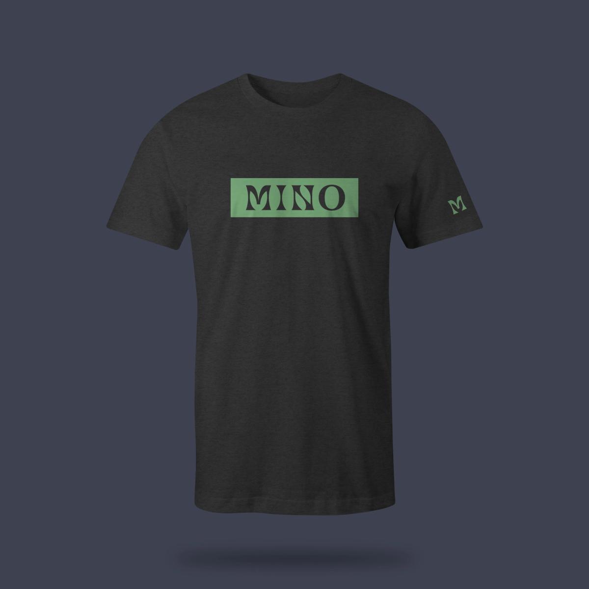
Hats, tees, and a custom pair of Nike Air Force 1s.